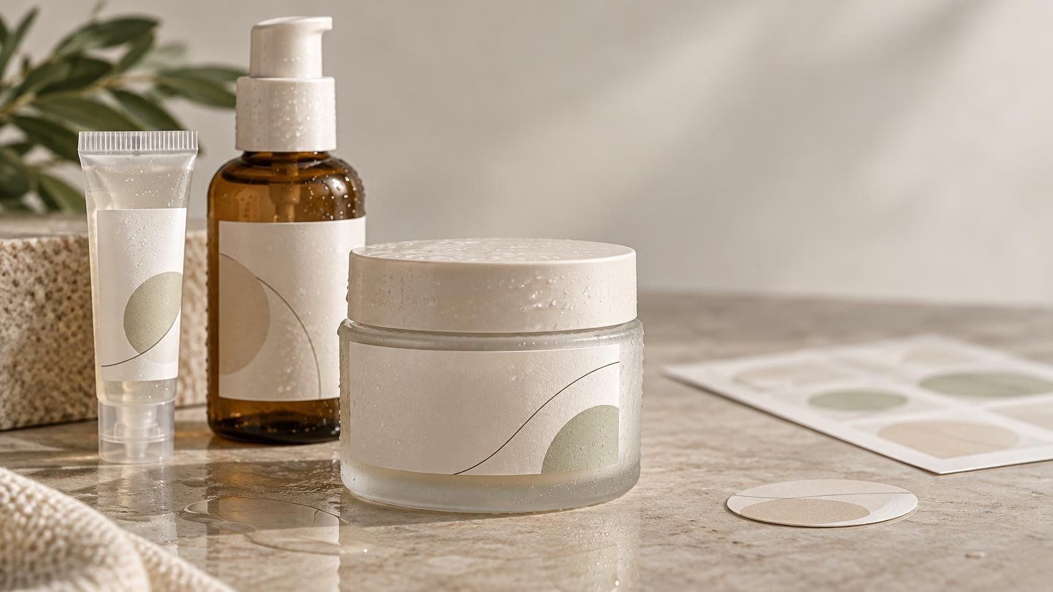
A cosmetic label has to perform several jobs in very little space. It must adhere to a jar, bottle or tube; remain readable around moisture and oily residue; apply without wrinkles; support the brand; and carry the information required for the product and market. A beautiful finish cannot compensate for an adhesive that lifts or text that becomes illegible at final size.
TLDR
- Start with the actual container, not a material swatch: glass and PET behave differently from plastics such as HDPE, LDPE and polypropylene.
- Map the real environment, including bathroom humidity, condensation, oil, handling, abrasion and container flexing.
- Use the package shape and application method to decide label size, construction and roll or sheet format.
- Build the artwork at final size and reserve space for required information before polishing the decorative design.
- Treat print production and regulatory compliance as separate workstreams. A printer can reproduce supplied artwork, but it does not determine whether the label is legally compliant.
Begin with five packaging questions
Before choosing cosmetic labels, answer five questions: What surface must the label stick to? What environment will it experience? How will it be applied? How many labels are needed? What must the design communicate and survive? Those answers expose the real tradeoff among appearance, durability, application speed, production format and cost.
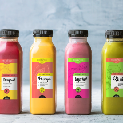
Record the container material, finish and shape rather than writing only “plastic bottle.” Smooth PET and glass are generally easier adhesive-bonding surfaces than HDPE, LDPE and polypropylene. Those lower-surface-energy plastics may require a specifically matched adhesive and application testing. Dust, oils, moisture, application temperature and service temperature can also affect pressure-sensitive adhesion, as outlined in the Avery Dennison pressure-sensitive labeling guide.
Match the label to the surface and container shape
Small cosmetic packages introduce tight curves, shoulders, seams and closures. A label that looks modestly sized on a flat proof can wrap too far around a lip-balm tube or bridge onto the shoulder of a serum bottle. That creates tension at the edges and encourages lifting. Adhesion also develops over time, so immediate appearance is not the whole test; roughness and temperature can influence the bond.
Measure the genuinely usable panel while the container is filled and closed. Keep the label away from pronounced tapers, molded lettering, hinges and cap interfaces. If the package squeezes, test whether the facestock and adhesive move with it rather than buckling or releasing.
Clear labels can create a direct-printed look on transparent or colored containers, but the container and product become part of the design. Without an opaque white layer, colors may become translucent or shift against the contents. CustomLabels currently states that white ink is available on its clear roll-label construction and lists glossy transparent and matte or frosted appearances. That product page describes permanent adhesive intended for metal, plastic and glass and identifies the construction for indoor use. These are construction-specific claims, not promises that every clear label will suit every cosmetic package.
Plan for water, oil and repeated handling
Bathroom and vanity products encounter more than an occasional splash. Pumps can deposit lotion around the neck, wet hands repeatedly grip the bottle, and jars may collect oil along the sidewall. Identify whether the risk is application-time moisture, later water exposure, oily contamination or abrasion; each can demand a different construction or workflow.
Apply labels to clean, dry containers unless the selected adhesive documentation explicitly says otherwise. Avery Dennison’s bottle-label guidance notes that water on the application surface can reduce initial tack and specifies a dry application surface. A proof can reveal copy errors and poor hierarchy, but it cannot establish performance on a damp, oily, flexible or chilled package.
Run a small packaging trial before scaling. The process in this small-batch label testing guide is useful for separating design approval from physical performance. Apply labels under normal production conditions, allow dwell time, and then expose samples to realistic handling, humidity, splashes, oil and flexing. Check edges, seams, print legibility and surface scuffing over several days rather than judging only the first container.
Choose a format around the application workflow
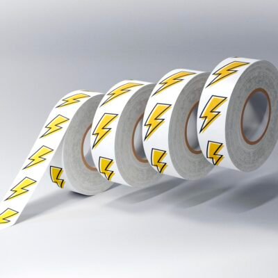
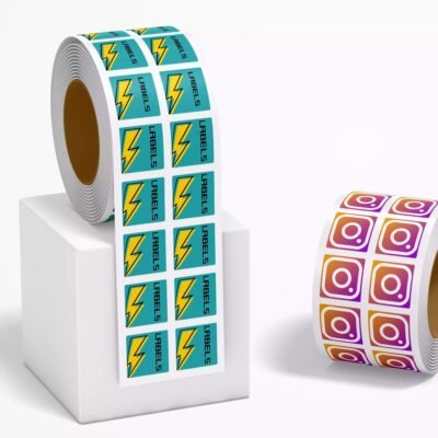
Sheet labels are convenient for hand application and small batches because multiple labels are easy to store and access on a flat liner. Roll labels become more useful when quantities increase, labels are dispensed at a workstation or an applicator is introduced. CustomLabels currently lists both sheet and roll formats and presents roll labels for dispenser or applicator use. Minimum quantities vary by product and format, so check the exact product page rather than relying on a general site statement.
Machine application adds requirements that hand labeling can hide. Obtain the applicator’s required core size, roll diameter, gap, winding direction and label orientation before ordering. There is no universal unwind direction. A roll that feeds correctly on one applicator may present the label upside down or leading-edge first on another.
Keep regulated package labels distinct from decorative seals and promotional handouts. If a project is primarily decorative, custom stickers, vinyl materials and related print options may offer a more appropriate production path, but the cosmetic package still needs a construction and information layout suited to its actual use.
Design at the final container size
Small packaging punishes artwork designed only at a comfortable screen magnification. Set the dieline to the final dimensions, include the printer’s required bleed, and keep important text inside the safe area. Print a size-accurate paper mockup and wrap it around the container to check curvature, seam placement, contrast and the reading order.
Pay particular attention to narrow type, ingredient lists, fine lines and reversed text. A QR code or barcode also needs adequate contrast, quiet space and a sufficiently flat scanning area. Test codes from the finished-size proof and again on a production sample; successful scanning on a large monitor proves little about a code wrapped around a small tube.
Keep printing guidance separate from cosmetic compliance
For cosmetics sold at retail in the United States, the principal display panel generally needs an identity statement and an accurate net-quantity declaration. The information panel generally carries the firm name and address, ingredient declaration, directions when material, and applicable warnings or cautions. The FDA summary of cosmetic labeling requirements should be the starting point for the current federal rules.
FDA states that retail-cosmetic ingredients generally must appear conspicuously in descending order of predominance, subject to provisions for color additives and ingredients present at 1% or less. The usual minimum letter height is 1/16 inch, reduced to 1/32 inch when the total available labeling surface is under 12 square inches. Small packaging therefore requires an information plan, not simply smaller typography.
The outer retail package and the immediate container can have different labeling roles. Required statements must remain prominent and conspicuous, and FDA guidance says the bottom of a package is generally not an acceptable location for required information. A carton may provide more room, but its existence does not justify guessing which information can disappear from the bottle or jar.
Claims can also change the product’s regulatory position. FDA explains that intended use may be established through label and other labeling statements. Moisturizing is a cosmetic claim, while statements about treating disease, removing wrinkles or increasing collagen production can move a product into drug or device territory. Cosmetic labels and advertising also should not state or imply that a product is “FDA approved.” Terms such as “hypoallergenic,” “fragrance-free” and “for sensitive skin” have no governing federal definition, but the labeling still must not be false or misleading.
Use a sample-based ordering checklist
- Confirm the container material, surface texture, taper, diameter and usable label panel.
- Document moisture, oil, temperature, abrasion and flexing during application, storage and use.
- Choose facestock, adhesive and protective finish as one construction rather than isolated upgrades.
- Decide between sheets and rolls from the quantity and application method; obtain applicator specifications when relevant.
- Build artwork at final size with the correct dieline, bleed, safe area and white-ink layer where required.
- Review identity, net quantity, ingredients, responsible-firm details, directions, warnings and claims against the current rules for the market.
- Approve both a content proof and a physical container test before placing a larger order.
The strongest cosmetic label specification begins with the package and ends with a real-use test. Select the construction for the surface and environment, choose the supply format for the application workflow, and reserve enough design space for readable information. Then have the regulatory content reviewed separately from the print proof. That sequence prevents a polished label from becoming either a packaging failure or a compliance problem.
References
- Avery Dennison
- Adhesives Glossary | Avery Dennison | LPM
- Clear Roll Labels – CustomLabels
- PET Wine Bottles Technical Overview
- Shop Labels – CustomLabels
- High Quality Custom Labels – Fast and Free Shipping
- Paper Roll Labels – CustomLabels
- Summary of Cosmetics Labeling Requirements | FDA
- Cosmetics Labeling Regulations | FDA
- Cosmetics Labeling Guide | FDA
- Wrinkle Treatments and Other Anti-aging Products | FDA
- Allergens in Cosmetics | FDA