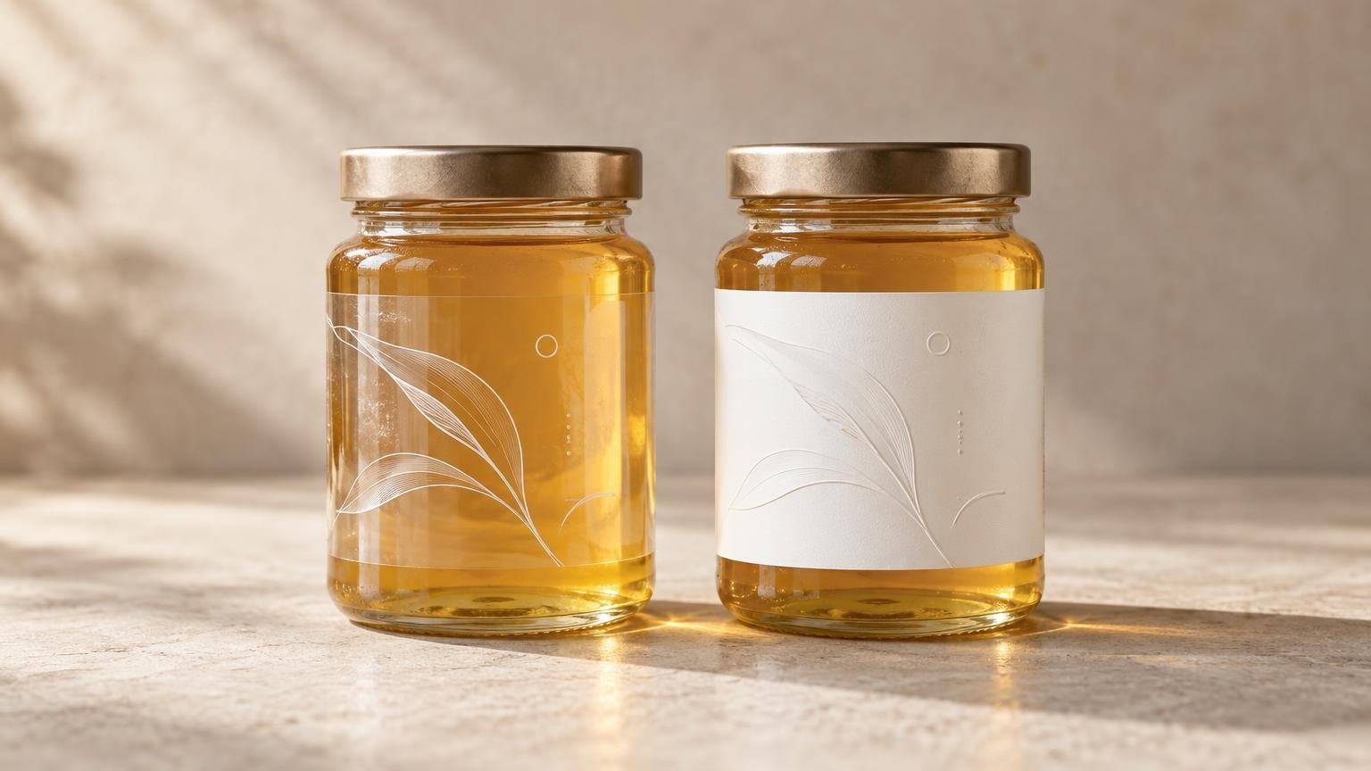
TLDR: Choose clear BOPP when transparency is an intentional part of the packaging design and the filled container supplies a suitable background. Choose white BOPP when consistent color, dense information, small text, or predictable contrast matters more. Neither color automatically determines moisture, oil, refrigeration, abrasion, or application performance; those depend on the complete label construction and should be tested on the actual package.
The central choice in clear vs white BOPP labels is opacity, not a universal difference in durability. Clear film allows the container, product color, fill level, and anything behind the package to affect the artwork. White film creates an opaque print field that behaves more like a controlled canvas.
Before choosing, answer five questions: What surface must the label stick to? What environment will it experience? How will it be applied? How many labels are needed? What must the design communicate and survive? The right answer balances appearance, readability, durability, application speed, production format, and cost.
What clear and white BOPP describe
BOPP stands for biaxially oriented polypropylene, a film used as label facestock. The facestock is only the printable face of a pressure-sensitive label. The complete construction can also include ink, white ink, a protective varnish or laminate, adhesive, and a release liner. Container material and real service conditions complete the system.
Clear and white identify two different visual forms of the facestock. Film-selection guidance from Avery Dennison lists both clear and white BOPP options while emphasizing application, container material, flexibility, finish, graphics, and end-use testing. Avery Dennison’s film materials guide provides a useful technical overview.
That distinction prevents a common ordering mistake: specifying “BOPP” without specifying the rest of the job. Two labels with a similar face film can perform differently if their adhesives, coatings, liners, printing systems, or application conditions differ. Obtain the exact construction rather than assuming all BOPP labels are interchangeable.
Clear vs white BOPP labels at a glance
| Decision factor | Clear BOPP | White BOPP |
|---|---|---|
| Visual effect | Lets the package show through and can support a no-label-style appearance | Creates an opaque, defined label panel |
| Artwork background | Changes with the container, contents, fill level, and viewing angle | Provides a more controlled background for printed color |
| White ink | Often useful beneath selected graphics or copy when the print process supports it | Usually less central because the facestock already supplies a white field |
| Information density | Best when the design preserves deliberate areas of contrast | Usually more forgiving for dense copy, fine details, and mixed information |
| Package consistency | Can look different across container colors or product variants | Helps unify artwork across packages with varying backgrounds |
| Primary risk | Unexpected show-through or weak contrast | Covering more of the package or product view |
| Durability | Must be established from the complete construction and testing | Must be established from the complete construction and testing |
When clear BOPP works better
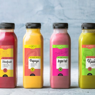
Clear BOPP is strongest when package visibility is a design asset. It can suit a transparent bottle where the product color supports the brand, a jar where customers should see the contents, or a minimalist package intended to appear printed rather than covered by a separate white panel.
The package becomes part of the artwork, however. A dark beverage may make black copy disappear. An amber bottle can shift the apparent color of transparent printed areas. A changing fill level can place the same text over product, air, or a background seen through the opposite side of the container. Clear glass on a shelf may also reveal whatever packaging or lighting is behind it.
Clear film does not literally become invisible. Its edges, adhesive layer, surface gloss, trapped air, and differences between labeled and unlabeled areas may remain noticeable. Mock up the design at final size and place it on a filled production container rather than judging it only against a white computer screen.
Use white ink as a design tool
Many printing systems use white ink beneath selected elements on clear film. An opaque white underbase can help a logo, color block, or small copy remain distinct from the package. White ink can also be printed as a visible design color while other areas remain transparent.
Do not assume white ink is automatically applied beneath every element or available through every ordering route. Confirm which artwork areas receive white, whether transparent areas are intentionally left unprinted, and how the printer wants the white layer represented in the file. Request an on-package proof or production sample when the result is critical.
CustomLabels currently describes its Clear Roll Labels as offering glossy transparent and matte clear or frosted appearances, along with a white-ink option. The page also describes permanent adhesive, water resistance, indoor use, and example applications to metal, plastic, and glass. It does not identify that product’s clear facestock as BOPP, so buyers should not treat the page as confirmation of a clear-BOPP construction.
When white BOPP works better
White BOPP is generally the safer design choice when the label must carry substantial product information or maintain a similar appearance across several package backgrounds. The opaque face provides a stable field for brand colors, fine details, instructions, variable information, and small copy.
Consider white film when the container is colored, patterned, opaque, or visually inconsistent between production batches. It can also simplify a family of products sold in different flavors or colors because the artwork is less dependent on what sits behind the label.
The tradeoff is coverage. A large white label can conceal contents or interrupt a package designed around transparency. A smaller opaque panel, a shaped label, or a clear label with selective white ink may provide a useful middle ground.
Protect readable copy and functional codes
Ingredient text, instructions, warnings, barcodes, QR codes, lot information, and other operational content need dependable contrast. On a clear label, reserve a controlled background for these elements rather than allowing them to float over changing product colors. White ink or an opaque printed panel may help, but the finished result still needs testing.
Test barcodes and QR codes after printing and after application to a filled container. Scan multiple samples with the devices and workflows that will actually be used. Curvature, glare, distortion, seams, and transparent backgrounds can all interfere with reliable use even when the code looks acceptable in the artwork file.
Keep important copy away from the cut path and place required bleed beyond it according to the printer’s current template. Review type at final physical size, not only while zoomed in. The CustomLabels design tool currently supports choices such as shape, size, material, and quantity, as well as uploaded graphics and added QR codes or product details, but production requirements should still be confirmed for the selected product.
Match the label to the container and environment
Start with the substrate: glass, metal, paperboard, or a specific plastic. Some plastics are harder for adhesives to bond to than clean glass or metal. Surface texture, mold-release residue, oil, dust, and condensation can also affect adhesion. Apply test labels using the same cleaning method, application temperature, and handling process planned for production.
Shape matters as much as material. A flat panel is relatively straightforward. A small-diameter tube, tapered bottle, compound curve, or squeezable container can place the facestock and adhesive under continuing stress. Watch for edge lift, tunneling, wrinkling, flagging, and distortion after application and during normal use.
For refrigerated, wet, oily, chemically exposed, or heavily handled products, ask about the complete construction. Confirm the adhesive, application-temperature requirements, service-temperature range, ink protection, laminate or varnish, and compatibility with the container. Clear versus white alone does not establish water, oil, chemical, UV, freezer, or abrasion resistance.
A sensible test includes filled packages exposed to their expected storage and handling cycle. Inspect initial adhesion, edge behavior, readability, scuffing, and appearance after the package reaches its real environment. Guidance for film materials similarly recommends evaluating graphics and end-use performance for the intended application.
Choose a production format and application method
The face-film color does not decide whether labels should arrive on rolls or sheets. Sheets can be convenient for small quantities, varied designs, and manual application. Rolls are often easier to dispense repeatedly and may support compatible automated or semi-automated applicators. See the practical differences in roll labels versus sheet labels.
Machine application requires more than ordering “labels on a roll.” Obtain the applicator’s requirements for core size, maximum roll diameter, label gap, liner width, winding, and unwind direction. Also verify which edge leads into the machine and whether the container orientation matches the artwork. CustomLabels states that its roll-label category supports hand or machine application, but individual equipment compatibility still requires confirmation.
Keep the product category aligned with the job. Pressure-sensitive packaging labels need specifications tied to the container and service environment. If the project is instead a promotional handout or decorative piece rather than package identification, custom stickers may be a separate sourcing path; that does not replace packaging-specific adhesion and end-use testing.
Keep print decisions separate from compliance
A clear or white background is a production and design decision, not legal approval. A printer’s proof may confirm layout and print appearance, but it does not determine whether required statements, placement, prominence, terminology, or other regulated details comply with applicable rules.
For food packaging in the United States, consult the FDA’s labeling and nutrition guidance hub and determine which rules apply to the particular product. Other categories and jurisdictions may involve different authorities. The broader distinction between substrate choices and regulatory obligations is covered in this guide to food-label materials and FDA requirements.
Pre-production checklist
- Identify the exact container material, surface texture, curvature, and dimensions.
- Evaluate artwork on a filled production container under normal shelf or use lighting.
- For clear film, check every design element against the darkest, lightest, and least predictable background it may encounter.
- Confirm whether white ink is supported and specify exactly where it should print.
- Review small text at final size and test every barcode or QR code after application.
- Confirm the facestock, adhesive, ink system, protective coating, liner, and relevant environmental limits.
- Test application at the planned temperature using the real cleaning and handling process.
- Expose samples to expected moisture, refrigeration, oil, abrasion, flexing, or other service conditions.
- For machine application, obtain the required core, roll diameter, gap, orientation, and unwind specifications.
- Run a small batch before scaling; use small-batch packaging tests to identify failures before a larger order.
- Verify current product options rather than assuming a clear or glossy roll-label listing uses BOPP.
Choose the background that controls the right variable
Choose clear BOPP when transparency contributes meaningfully to the package and the artwork remains readable across real containers and contents. Choose white BOPP when you need an opaque, predictable print field for consistent color, dense information, fine details, or variable package backgrounds.
Then move beyond color. Confirm the full construction, test it on the actual filled package, and reproduce the intended application process. The best-looking material is only the right choice if it also sticks, applies cleanly, survives its environment, and keeps essential information usable.