TLDR: Effective supplement labels begin with the physical bottle, not an artwork template. Measure the usable label area, choose a construction and format for the application environment, and reserve enough room for readable product information before developing the visual design. Treat the U.S. regulatory review as a separate checkpoint: a printer can reproduce approved artwork, but it does not determine whether the product classification, Supplement Facts panel, claims, warnings, or other copy comply with applicable requirements.
The difficult part is balancing five questions: What surface must the label stick to? What environment will it experience? How will it be applied? How many labels are needed? What must the design communicate and survive? Those answers determine the tradeoff among appearance, durability, application speed, production format, and cost.
Start supplement labels with the actual container
Obtain production containers before finalizing the dieline. Nominal capacity alone is not enough: two bottles sold as the same size can have different straight-wall areas, shoulder transitions, base curves, seams, and cap clearances. Measure the circumference and the height of the genuinely flat labeling panel. Exclude areas where the wall begins to taper unless a physical trial shows that the label can conform without wrinkling or lifting.
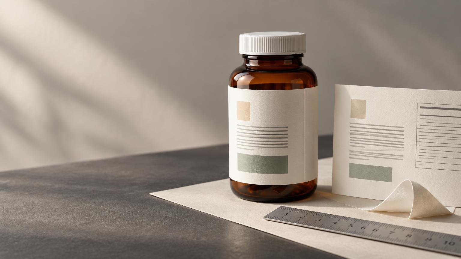
For a wrap label, use a flexible strip of paper to mock up the width. Decide whether the ends should meet, stop with a gap, or overlap. A modest gap can make hand application more forgiving, while an overlap can create a visible ridge and may obscure copy if its location was not planned. Never place a barcode, dosage direction, lot code, or important text across the seam.
Small-diameter bottles create another challenge: the reader can see only a narrow portion of the label at once, and a relatively stiff label may resist the tight curve. Test the complete construction on the filled container rather than evaluating facestock, adhesive, or finish in isolation. The detailed guide to measuring a bottle for a label provides a repeatable measurement process.
Choose the package architecture before designing
A full wrap provides one continuous canvas and usually uses the bottle efficiently, but application alignment and seam placement become important. Separate front and back labels can create a clean branded face and a dedicated information area. They also leave a visible gap that may help the customer distinguish the panels, although applying two labels adds another positioning step.
A label-plus-carton system offers more communication space, but it adds components, cost, inventory coordination, and another surface requiring regulatory review. Before choosing among these structures, build a plain-text content map that accounts for product identity, net quantity, Supplement Facts, ingredients, business information, directions, warnings, barcode, and any space needed for lot or date coding. Not every item applies identically to every product, so regulatory reviewers should confirm the final list and placement.
If a launch also uses promotional seals or secondary graphics that do not replace required package information, custom stickers can be treated as a separate packaging component. Keep decorative elements away from required copy, opening areas, and any coding zone.
Give dense Supplement Facts copy enough room
For a U.S. dietary supplement, the nutrition label is called the Supplement Facts panel. FDA guidance addresses serving information, dietary ingredients, quantities, panel formatting, and certain constrained-package formats. It is not interchangeable with the Nutrition Facts panel used for conventional foods. FDA’s dietary-supplement nutrition-labeling guidance should be part of the compliance review.
When the approved copy does not fit, making all text smaller should not be the first response. Reconsider the label height, move from separate labels to a wrap, select a larger container, reduce optional marketing copy, or use an additional package component where appropriate. A larger legal panel with controlled branding is usually more workable than a visually dramatic label whose essential information is difficult to read.
Create the required information panels first, lock their approved content, and then develop the front-panel hierarchy around the remaining area. Review the design at printed size, not only while zoomed in on a monitor. Long ingredient names, footnotes, serving details, and narrow columns can look manageable on screen but become crowded on a small bottle.
Match format and finish to the workflow
Roll labels often suit repeated hand application, dispensers, and compatible automatic or semi-automatic equipment. Sheet labels can be convenient for small batches, multiple versions, or workflows where operators pick individual designs from a sheet. Format is an operational choice rather than a quality grade; the roll labels versus sheet labels comparison explains the practical differences.
For machine application, ask the equipment supplier or production team for the required core, maximum roll diameter, web width, liner behavior, and unwind direction. There is no universal orientation. A roll that presents the top of the artwork correctly for one applicator may feed sideways or backward on another.
Matte, gloss, and clear treatments primarily change presentation, glare, and how graphics interact with the container. They do not automatically establish moisture resistance, chemical resistance, or regulatory suitability. Clear artwork may also need an intentional white layer beneath selected elements so that small text and brand colors remain visible against the product or bottle. Review the broader comparison of matte, glossy, holographic, and clear labels, then verify the exact construction offered for the order.
Test the label in its real environment
Identify the bottle material and surface condition. Glass, coated paperboard, metal, and different plastics do not present the same bonding surface. Mold-release residue, dust, oil, condensation, and handling can interfere with application. Low-surface-energy plastics can be particularly demanding, so container identification and an applied sample are more useful than a broad claim that an adhesive is permanent.
Apply test labels using the planned method, then expose them to realistic storage and handling. Look for edge lift, tunneling, wrinkling, adhesive movement, scuffing, ink loss, and reduced readability. Include refrigeration, humidity, oily hands, bathroom storage, shipping abrasion, or cleaning exposure only when those conditions reflect the product’s real journey. A small pilot order can reveal these failures before thousands of labels are produced; see the small-batch packaging test process for a structured trial.
Prepare print-ready artwork without sacrificing function
Set the document to the final approved label dimensions and use the printer’s current template when available. Extend background colors or images through the required bleed beyond the cut line, and keep important text inside the safe area. The cut path defines the finished shape; bleed prevents an unintended white edge when normal cutting variation occurs.
Preserve strong contrast for small copy. Busy imagery, transparent areas, metallic effects, or low-contrast color combinations can reduce legibility even when the type technically fits. On a clear label, preview the artwork against the actual filled bottle and identify which areas need white ink or another opaque foundation, subject to the selected printer’s capabilities.
Keep barcodes away from seams, strong curves, reflective distractions, and the cut edge. Preserve the blank quiet zones around the code, generate the symbol from final data, and test a production sample with the scanners used in the intended workflow. A successful scan from a large monitor image does not validate the printed code on a curved bottle.
During proof review, verify dimensions, spelling, ingredient order, quantities, claims, panel placement, seam position, code data, variable fields, and the relationship between artwork and the cut line. A proof can show that the supplied file will reproduce as presented; it does not, by itself, certify regulatory compliance or guarantee performance on an untested container.
Run a separate U.S. compliance checkpoint
First confirm that the product is legally categorized as a dietary supplement. A beverage, conventional food, cosmetic, topical product, or drug may fall under a different framework even if its marketing uses wellness language. State rules, retailer requirements, export markets, and product-specific issues can add obligations beyond the U.S. federal points summarized here.
FDA’s dietary-supplement guide identifies five general label statements: a statement of identity, net quantity of contents, nutrition labeling, an ingredient list, and the name and place of business of the manufacturer, packer, or distributor. Its guidance also discusses how required information is divided between the principal display panel and information panel. Brands should use the FDA Dietary Supplement Labeling Guide and qualified regulatory advice to review the complete package rather than treating this list as a finished template.
Claims require their own review. FDA states that eligible structure/function claims require substantiation, a disclaimer, and notification to FDA no later than 30 days after first marketing. That does not mean adding a disclaimer makes any claim acceptable. The FTC explains that implied messages conveyed by the overall presentation can matter and that a disclaimer does not cure an otherwise deceptive claim. Review words, product names, imagery, testimonials, symbols, and layout together, not as isolated pieces.
Preorder checklist
- Confirm the product classification and intended U.S. markets.
- Measure production containers, including the straight-wall area, circumference, seams, shoulders, base curves, and cap clearance.
- Choose a full wrap, separate front-and-back labels, or a label-plus-carton architecture before polishing artwork.
- Reserve space for all approved required copy, barcode quiet zones, seam clearance, and lot or date coding.
- Confirm the bottle substrate, storage conditions, filling process, and expected exposure to moisture, oil, abrasion, heat, or cold.
- Test the proposed facestock, adhesive, ink, and protective finish as one construction on the actual filled container.
- For applicators, obtain core, roll diameter, web width, liner, and unwind requirements from the equipment workflow.
- Review the design at final printed size and test production barcodes on the curved package.
- Complete regulatory and claims review before approving the production proof.
- Recheck current material options, minimums, turnaround, proofs, shipping, and other order terms on the final product path.
Make fit and compliance separate approvals
A dependable supplement-label project has two approval tracks. Production approval asks whether the label fits, sticks, survives, scans, and applies efficiently. Compliance approval asks whether the product classification, required statements, panel structure, claims, and overall presentation meet the rules for the intended market. Resolve both before scale production. The most useful next step is to label a real filled container with a final-size prototype, review it under actual handling conditions, and send the complete package presentation—not merely isolated text—to the appropriate compliance reviewer.