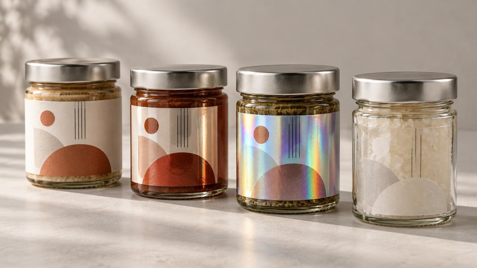
TLDR
The matte vs gloss vs holographic vs clear labels decision begins with appearance, not durability. Choose matte for a quieter, low-reflection presentation; gloss for shine and apparent color intensity; holographic for a rainbow, light-reactive effect; or clear when the package should remain visible. Then confirm the facestock, adhesive, protective layer, container compatibility, and service environment. A finish name alone does not establish resistance to water, oil, refrigeration, abrasion, or chemicals.
Before choosing among matte vs gloss vs holographic vs clear labels, ask five questions: What surface must the label stick to? What environment will it experience? How will it be applied? How many labels are needed? What must the design communicate and survive? Those answers separate a visually attractive finish from a label construction that works on the actual package.
Matte vs gloss vs holographic vs clear labels at a glance
| Style | Visual effect | Design behavior | Good starting point for |
|---|---|---|---|
| Matte | Soft, subdued, and relatively low-reflection | Reduces distracting glare but can make colors appear less punchy than gloss | Text-forward layouts, restrained branding, and packaging photographed under bright light |
| Gloss | Shiny and reflective | Can increase the perceived vibrancy and contrast of printed colors | Bold retail graphics, saturated colors, and packaging intended to catch light |
| Holographic | Rainbow reflections that shift with viewing angle | The substrate becomes part of the artwork and can compete with fine details | Limited editions, promotional packaging, and designs built around a light-reactive effect |
| Clear | Transparent or frosted, depending on the construction | The container and product color affect the printed result; white ink may be needed | A no-label look, visible products, glass bottles, jars, and transparent containers |
CustomLabels currently lists dedicated glossy, matte, holographic, and clear roll-label styles. The label-style catalog is useful for checking current format availability, but the exact construction should be verified on the individual product page before ordering.
Choose matte when glare and restraint matter
Matte labels scatter rather than strongly reflect light, creating a softer appearance. This can make small text and understated typography easier to view in some lighting because fewer bright reflections pass across the printed area. Matte often suits candles, coffee packaging, natural products, cosmetics, and premium designs that depend on texture and restraint rather than shine.
The tradeoff is that matte does not usually deliver the same perceived color intensity as a glossy surface. Dark fields can look softer, and a design built around vivid photographic color may lose some of its visual punch. Avery’s finish comparison similarly characterizes matte as soft and non-reflective, while gloss is more reflective and can enhance perceived color vibrancy and contrast.
Do not assume matte automatically resists fingerprints, scuffs, or scratches better. A matte surface may make certain smudges less visually obvious, but physical resistance depends on the facestock, ink system, laminate or varnish, handling conditions, and test method. Ask what protective layer is included and evaluate a sample rather than treating “matte” as a durability specification.
Choose gloss for shine and apparent color pop
Gloss labels reflect more light and can make saturated colors, deep blacks, photographs, and high-contrast graphics appear more vivid. That makes gloss a practical starting point for colorful sauces, beverages, children’s products, promotional packaging, and other designs expected to stand out at a distance.
Reflection is also the main compromise. Bright overhead lighting can create glare across text, barcodes, or QR codes. This does not make gloss unsuitable, but it raises the importance of text size, contrast, code placement, and testing under the lighting where the package will be used. Avoid placing critical information where a bottle curve or shoulder concentrates reflections.
Gloss is a visual description, not proof that every glossy label has the same moisture or abrasion resistance. A gloss coating, gloss laminate, and glossy film facestock can represent different constructions. Confirm what the supplier means by the term and whether that exact combination is appropriate for the container.
Choose holographic when the material should participate in the design
Holographic material produces rainbow reflections that change with light and viewing angle. It can turn a simple shape or limited color palette into an active visual effect, making it well suited to special releases, event packaging, collectibles, security-inspired graphics, and promotional products.
CustomLabels describes its holographic roll labels as using holographic gloss BOPP with a rainbow light-reflective effect and says matte or gloss lamination can be selected. The page also describes that construction as water-resistant. Those statements apply to the listed product construction, not to every holographic label on the market.
A matte laminate over holographic material does not remove the holographic base. It can soften surface glare while allowing the underlying light-reactive pattern to remain visible. Request a proof or sample because the final balance between muted surface reflection and rainbow effect is difficult to judge from a monitor.
Keep essential information visually separate from the busiest reflective areas. Small type, thin lines, barcodes, and QR codes need stable contrast. An opaque printed field or white underprint may help, but white-ink availability and setup must be confirmed for the exact holographic roll-label product; availability on another holographic product does not establish availability for the roll construction.
Choose clear when the package should remain visible
Clear film can create a no-label look by allowing the bottle, jar, or product to show through the printed design. The Avery Dennison film materials guide identifies clear film as a route to that effect while emphasizing that the construction still needs to match the container shape, moisture exposure, and application requirements.
There are two visually different starting points. Glossy transparent clear material emphasizes transparency and shine. Matte clear material creates a frosted appearance that diffuses the view through the label. CustomLabels currently describes both options for clear roll labels and states that white ink is available. Its page also describes a clear facesheet with permanent adhesive for metal, plastic, and glass, although compatibility should still be tested on the exact surface.
Plan the white ink before approving clear artwork
Normal process inks are not fully opaque. On clear material, the container color and product behind the label can alter their appearance. Yellow ink on a blue bottle, for example, may not resemble the yellow shown against a white design canvas.
A white underprint is a layer of white ink placed beneath selected colors to make them appear more opaque and consistent. White ink is also necessary when the finished design must contain visible white elements; without it, white areas in the file may simply become transparent. Clear-label guidance and the current CustomLabels product description both identify white ink as an option for controlling this interaction.
White ink does not have to cover the entire label. It can sit behind a logo, ingredients panel, fine text, or barcode while leaving other areas transparent. Confirm how the printer wants white-ink areas identified in the artwork, whether partial underprinting is supported, and how the effect will appear in the proof.
Treat fingerprints, scuffs, and durability as separate questions
A fingerprint being visible is not the same as the label being damaged. Reflective gloss and clear surfaces may make skin oils conspicuous under directional light, while a matte surface may disguise them better in some settings. Holographic reflections can either hide or emphasize marks depending on the angle. None of those visual tendencies establishes scratch or abrasion resistance.
For a handled product, test for both appearance and physical performance. Rub the label with dry fingers, expose it to the expected moisture or oil, place it in refrigeration if applicable, and repeat normal packing and shipping contact. Testing labels on small-batch packaging before scaling provides a practical workflow for evaluating the real container rather than relying only on a screen proof.
Surface preparation matters as well. Apply samples to clean, dry packages, then allow the adhesive time to build its bond before judging performance. Test around seams, tight curves, textured areas, and small-diameter containers. A label that looks excellent on flat glass may wrinkle or lift when the same size is wrapped around a tapered or squeezable package.
Use the packaging goal as your decision path
- Choose matte first if the priority is reduced glare, a soft presentation, or a text-forward design.
- Choose gloss first if the priority is shine, apparent color intensity, or bold shelf impact.
- Choose holographic first if the changing rainbow effect is an intentional part of the design rather than a background decoration.
- Choose glossy clear if the goal is maximum transparency and a polished no-label appearance.
- Choose matte clear if the product should remain partly visible through a frosted, subdued surface.
- Consider a different material family if the decisive issue is moisture, oil, chemicals, flexing, or difficult adhesion rather than appearance. A material comparison such as vinyl stickers versus paper labels can help frame that earlier construction decision.
- If the project is promotional rather than package labeling, the same finish logic can also inform the choice of custom stickers, but packaging labels still require container and environment testing.
Confirm the complete specification before ordering
Once the visual direction is clear, turn the finish choice into a production specification. This prevents an attractive proof from masking an unsuitable adhesive, liner, or application format.
- Identify the package material: glass, metal, paperboard, or the specific plastic type when known.
- Describe the surface: smooth, textured, coated, curved, tapered, squeezable, or low-surface-energy.
- Document application and service conditions, including application temperature, refrigeration, condensation, oil, chemicals, abrasion, heat, and outdoor exposure.
- Confirm the facestock, adhesive, and protective laminate or varnish instead of ordering by finish name alone.
- For clear or holographic material, specify where white ink or an opaque printed field is needed.
- Inspect text, barcodes, and QR codes at final printed size and against the actual package background.
- Confirm roll or sheet format. Machine-applied rolls also require the applicator’s core size, maximum roll diameter, gap, liner, and unwind direction.
- Approve a proof for layout and content, then test physical samples for adhesion, readability, handling, and appearance before committing to a large run.
Common finish questions
Which label finish creates the least glare?
Matte is normally the best starting point when glare reduction is the primary visual goal. Package shape, lighting, ink coverage, and any overlaminate still affect the result, so test curved or reflective containers under their actual display lighting.
Can holographic labels have a matte finish?
A holographic substrate can be paired with a matte surface treatment when that option is available. CustomLabels currently lists matte or gloss lamination for its holographic roll-label construction. The holographic effect remains, but its appearance can be softened.
Do clear labels always need white ink?
No. White ink is unnecessary when transparency and translucent color are intentional. It becomes useful when white artwork must remain visible or when selected colors, fine text, and codes need a more opaque, predictable background.
Do all four styles perform the same around water or oil?
No conclusion can be drawn from the finish name alone. Performance depends on the full construction: facestock, adhesive, inks, laminate or varnish, package surface, application conditions, and exposure. Verify the exact product specification and test it in the intended environment.
Make appearance the first choice, not the last test
There is no universal winner among matte, gloss, holographic, and clear labels. Matte controls reflection, gloss emphasizes shine and color, holographic turns light into part of the design, and clear lets the package participate in the artwork. Select that visual direction first, then validate the material, adhesive, protection, white-ink plan, application format, and package fit. The right next step is a proof for design accuracy followed by a physical sample on the actual container.