TLDR
A successful vitamin label has to solve two different problems: regulatory content and physical production. Measure the usable area on the actual bottle before designing, reserve enough room for required information at a compliant and readable size, and test the label around the container’s curves. Then choose the facestock, adhesive, finish and roll or sheet format for the bottle surface, filling process, storage environment and application method. A durable label construction does not make the copy compliant, and compliant copy does not guarantee that the label will apply cleanly.
Start with five questions, not a label template
Vitamin bottles often look simple until a dense Supplement Facts panel, ingredients, business information, directions, warnings, lot coding and a barcode compete for a narrow strip of packaging. Before placing any artwork, answer five questions:
- What is the bottle made from, and is its surface smooth, textured or low-surface-energy plastic?
- Will the package encounter moisture, oil, abrasion, heat, refrigeration or repeated handling?
- Will labels be applied by hand, with a dispenser or through an automatic applicator?
- How many units are needed now, and how repeatable must future production be?
- What information must the design communicate, and what must remain readable throughout the product’s use?
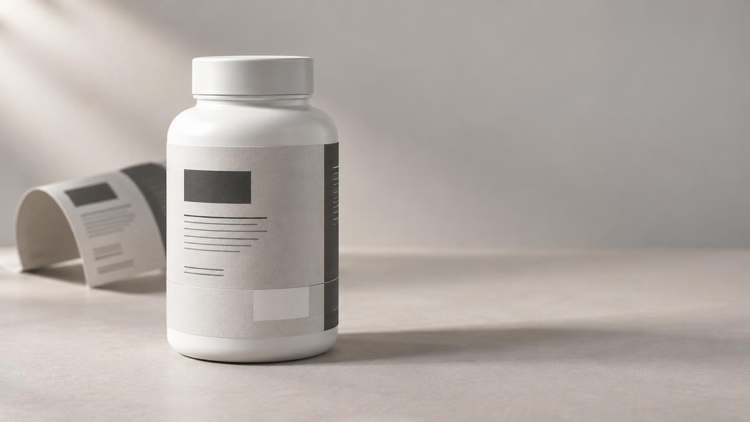
The bottle itself should be treated as the dieline. Measure the usable circumference and label height on a production container, not only from a supplier drawing. Exclude shoulders, base curves, molding seams and any area where the bottle diameter changes. For a deeper overview of measuring and organizing dense supplement copy, see the guide to supplement-label fit and FDA boundaries.
Bottle curves reduce the space you can actually use
A label can fit mathematically and still wrinkle, lift or distort. Small-diameter bottles create a tight bend across the label. Short bottles may also have compound curves near the shoulder and base, where the surface changes in more than one direction. Extending artwork into these areas increases the risk of edge lift and makes lines of type appear uneven.
Leave a deliberate gap between the label ends unless the construction was designed and tested for overlap. Keep critical text, barcodes and panel borders away from that seam. A paper facestock may provide the desired appearance, while a film such as BOPP may better suit exposure to moisture or repeated handling; however, performance depends on the complete construction, including adhesive and protective finish. The BOPP versus paper label comparison explains those tradeoffs without treating either material as universally better.
Small type is a compliance and production constraint
For U.S. dietary supplements, the principal display panel generally carries the product identity and net quantity. A product marketed as a dietary supplement must be identified accordingly, with wording such as “dietary supplement” or “vitamin supplement.” FDA’s identity-statement guidance explains this front-panel requirement.
The required labeling information generally also includes a Supplement Facts panel, an ingredient list, and the name and place of business of the manufacturer, packer or distributor. FDA says the information panel normally sits immediately to the right of the principal display panel as the consumer faces the package, and required information cannot be split by intervening material such as a UPC barcode.
For standard-size packages, 21 CFR 101.36 includes formatting rules for the Supplement Facts panel. Subject to provisions for small and intermediate packages, most panel content has an 8-point minimum, while certain headings and footnotes may use 6-point type. The title must be larger than the other nutrition-label text, and the nutrition information must follow specified heading, emphasis and box conventions. Read the current text of 21 CFR 101.36 rather than shrinking a generic panel until it fits.
Type size is only one part of readability. FDA’s general standard also calls for required text to be conspicuous, easy to read and shown with sufficient contrast; applicable text normally must be at least 1/16 inch high when measured by the lowercase “o.” Fine reverse type, condensed fonts and copy crossing a bottle seam can fail in practice even when a design file looks acceptable at high zoom.
Clear labels need a contrast plan
Clear facestock can let the bottle or tablets contribute to the design, but it does not provide a controlled background. Amber plastic, colored capsules, shadows and product level can all change how text appears. Dense required copy may need white ink beneath it or an opaque panel built into the artwork. This is especially important for the Supplement Facts box, small warnings and fine rules.
White and clear materials should be evaluated on the filled production bottle, not on a white screen or empty sample. The clear versus white BOPP guide covers opacity, white ink and package interaction in more detail.
Protect barcode space from the curve and the seam
A UPC needs more than enough room for the bars. GS1 US says barcode artwork needs unprinted quiet zones on both sides and should be created at the size required for the package. GS1 US barcode placement guidance provides the technical starting point.
Place the code on the most consistently flat and accessible part of the bottle. Avoid wrapping it around a tight curve, crossing the label seam or placing glossy decorative elements inside its quiet zones. Scan printed samples on filled bottles using the equipment expected in distribution or retail. A successful scan from a design PDF is not a package test.
Choose format around the application workflow
Sheet labels can work for short, varied runs applied by hand. Roll labels become more practical when operators use dispensers or when production moves toward semi-automatic or automatic application. The choice affects storage, liner handling, application speed and repeatability; it does not determine the material or regulatory status by itself. See roll labels versus sheet labels for a production-focused comparison.
For machine application, obtain the applicator’s required core size, maximum roll diameter, gap between labels and unwind direction before ordering. There is no universal roll orientation. Also confirm whether variable lot or expiration information will be printed before or after application and whether that printing process is compatible with the selected surface and finish.
Keep controlled vitamin-label artwork separate from ancillary promotional pieces. If the project also needs non-regulatory seals or branded inserts, CustomStickers custom stickers and artwork preparation is an adjacent option, but those items should not interrupt required information on the bottle label.
Claims require review beyond the print shop
FDA defines nutrient-content claims as statements that expressly or implicitly characterize a nutrient level. Defined terms have specific conditions: for example, FDA states that “high” generally requires at least 20% of the Daily Value per reference amount customarily consumed, while “good source” requires 10% to 19%. Structure/function and related claims must be truthful and non-misleading, substantiated and handled with the applicable notification and disclaimer requirements. Disease claims can move a product into drug-regulation territory.
A printer can reproduce approved artwork and flag obvious production risks, but it does not determine whether a formula, claim or label complies with applicable law. FDA does not generally preapprove dietary supplements or their labels before marketing; responsibility remains with the firm placing the product on the market. Regulatory review should therefore happen before final proof approval, not after labels are printed.
Run a bottle test before scaling
Apply production-representative samples to filled bottles and evaluate them through the expected packing, storage and handling cycle. A useful approval check includes:
- Confirm the label stays within the bottle’s straight, usable panel and does not bridge compound curves.
- Check adhesion at application and again after the adhesive has had time to build bond.
- Read all small copy at normal viewing distance under ordinary lighting.
- Inspect the Supplement Facts panel, ingredients, warnings and business information for omissions or unintended separation.
- Scan every barcode and QR code on the applied package, not just on a flat proof.
- Rub and handle the bottle to assess ink, coating and surface durability.
- Verify lot and date coding position, contrast and compatibility with the chosen finish.
- Record the approved bottle, label dimensions, construction, artwork revision and application settings for repeat orders.
The right vitamin label begins with geometry and required content, not decoration. Establish the regulatory copy footprint, fit it to the bottle’s genuinely usable area, and then specify the construction and format around real application conditions. That sequence produces a label that is more likely to remain readable, apply consistently and survive the package’s actual working life.
References
- Dietary Supplement Labeling Guide: Chapter II. Identity Statement | FDA
- Dietary Supplement Labeling Guide: Chapter I. General Dietary Supplement Labeling | FDA
- Questions and Answers on Dietary Supplements | FDA
- 21 CFR § 101.36 – Nutrition labeling of dietary supplements. | Electronic Code of Federal Regulations (e-CFR) | US Law | LII / Legal Information Institute
- Barcode Placement & Printing Guidelines | GS1 US
- Dietary Supplement Labeling Guide: Chapter VI. Claims | FDA
- Notifications for Structure/Function and Related Claims in Dietary Supplement Labeling | FDA